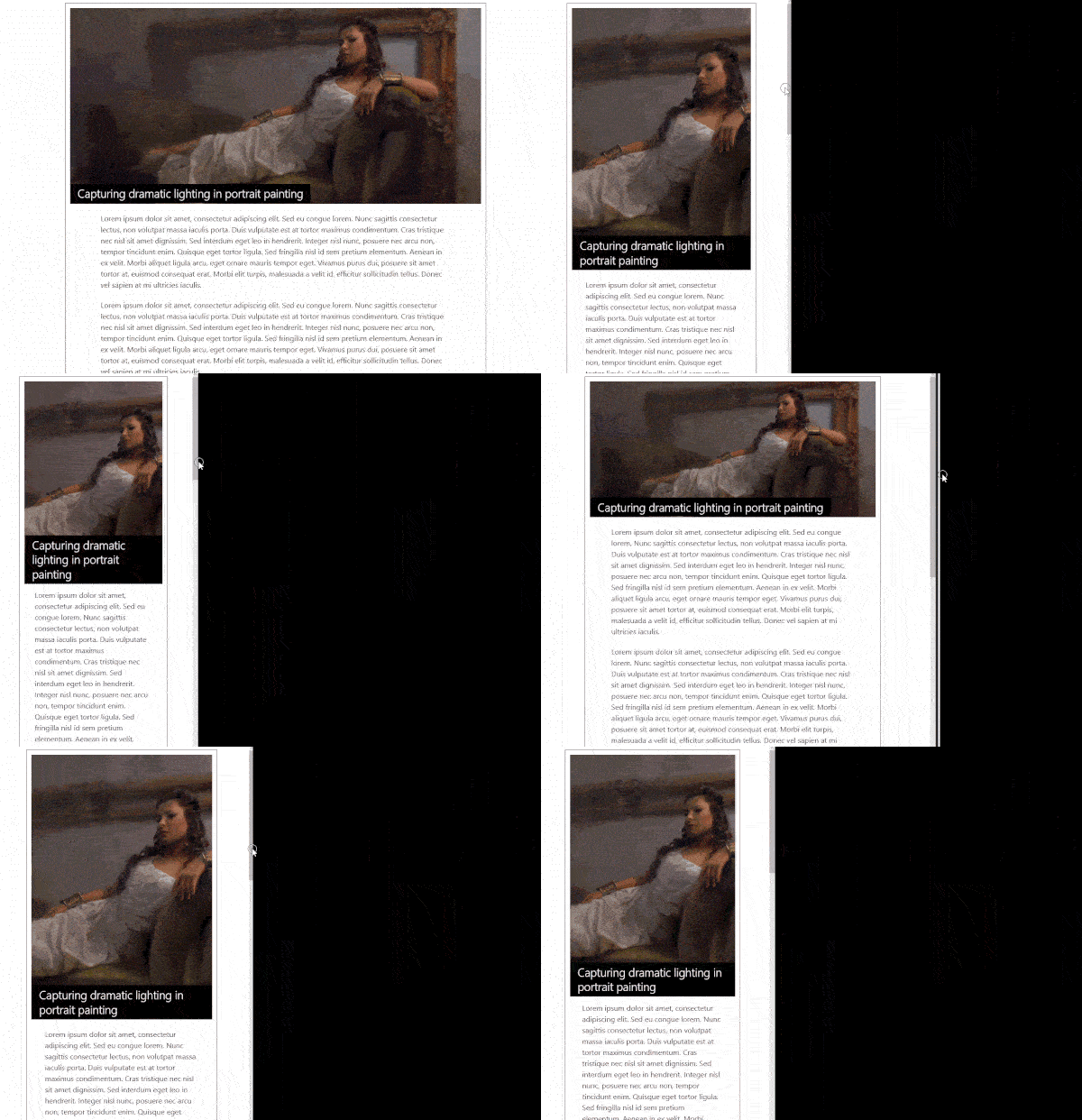
“Some platforms alter things like images to automatically be more mobile-friendly.”
Ever since the advent of smartphones, mobile responsive websites have become an ever-increasing need for businesses. In fact, according to statistics, mobile internet usage surpassed desktop internet usage sometime in 2014 and as of 2016 continues to grow.

What has been the response to all this mobile responsive shenanigans?
A lot of adaptation. And not just with businesses, but also with the platforms (WordPress, Drupal, etc.) these businesses run their websites on.
These platforms have taken some pretty effective measures to deal with the sweeping wave of mobile devices. Code has been added, functions have been tweaked and platforms have evolved to automatically format the entire website to fit and run on a mobile device. Not only that, some platforms alter things like images to automatically be more mobile friendly.
WordPress Responsive Images
Autommatic (the mad geniuses behind WordPress and a sleuth of other plugins and web services) have always been at the forefront of altering the WordPress to work as a mobile friendly platform. Not only that, they’re also in the business of providing tools which allow users to build their own mobile friendly websites.
One of the more interesting and recent alterations to the WordPress platform comes in the form of how it handles images.
If you’re at all familiar with the basics of WordPress, then you know that when you begin putting in content for a blog post, you are allowed the option of uploading and adding images through the media library.
In the past, these images would usually not cause too many issues. However, depending on the size (not dimensions but kilobytes/megabytes), the images could bog down your website and decrease pagespeed.
To combat this issue, WordPress began testing with a code attribute known as “srcset” (pronounced “source set”).
What is srcset?
To avoid going off into an extremely confusing tangent, I’ll just say that srcset was an experimental attribute created by web developers that you could add to the code used for images on a website. What it does is provide a way for a web designer to change an image depending on the resolution of the device (whether it’s a desktop, laptop, tablet or smartphone).
Here is an example of srcset in action:

So at this point you might be wondering what srcset has to do with WordPress.
Well, when one of the major updates (4.4) dropped for WordPress, it included support for the srcset attribute. When you upload an image to WordPress, it automatically creates several different sizes. This functionality has been inherent in WordPress for a long time.
With the addition of srcset support, the WordPress system will now automatically choose the image with the best dimensions and size for the device you’re using to look at the website.
This type of optimization increases pagespeed, which is one of the few factors that Google has actually said affect rank. When you rank higher, your website gets more eyeballs and you cultivate the potential for more clients, for more leads, for more of whatever you sell on your website.
Therefore srcset = very good for your website and by extension, your business.
WordPress is just one of many digital marketing topics on which we’re experts and we at Get Found Fast have developed a new seminar series called The Digital Download to help you discover the true digital marketer within yourself. Learn more on how to bring that marketer out and start to enhance an online presence for yourself, your company or your brand. Join us to learn how to master the techniques behind getting online leads, improving your website and growing your online revenue.

0 Comments