
Are you having trouble “hooking” your web audience?
Is it hard to have them travel through your website and engage as you’d planned?
Formulating your web design is one of the first and most important steps in creating an engaging site with high conversion rates.
In strategizing your web design and layout, don’t try and force the visual flow of things, stick to SCIENCE – scientific studies that show where viewers’ eyes are going naturally – such studies show that eyes move across your website from left to right, top to bottom, in a pattern much like an ‘F.’

What the “F” is an “F-Pattern?”
What’s happening a lot of times – as you are probably doing right now – is when most people “read” something (in this case a website), they’re not really reading ALL OF IT top-to-bottom, but they tend to SKIM or SCAN it.
As they’re scanning through these different blog posts or different web pages, their eyes tend to follow a certain pattern – an F-Pattern – scanning through the content.
It’s a natural reading instinct, to make sure what we’re reading is actually useful, relevant content.
So, the F-Pattern is what people naturally follow when they read content. In this case, content on your website!
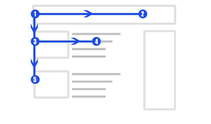
FIRST – viewers generally read across the full length of the headline and then return back to the left side of the page.
NEXT – they sort of scan across to the right again and pick up certain elements like visuals or sub headlines, before returning back to the left side of the page once again.
AFTER THAT – the eyes don’t venture out too much more to the right, and they only pick up a few more key things before they come to a conclusion and make their decision – should I stay or should I go?
What does the F-Pattern tell you about your users’ behavior?
- Most readers don’t actually read long blocks of text.
- It only takes users a few seconds to determine whether they like the content they see or not.
How do you use the F-Pattern to your advantage?
- Have the contact info in the top part of the page.
- Put your most important information FIRST.
- Make visuals and headlines (as well as call-to-actions) AWESOME, INTERESTING and ENGAGING.
- Use bullet points along the vertical length of the F-Pattern (as I’m doing now).

The ‘F’ Doesn’t Stand for ‘FLAWLESS,’ though…
Yes, this pattern is a successful layout to your web pages, but it’s not the be-all, end-all solution.
There are other layout patterns you can try, such as the Z-Pattern and the Gutenberg diagram. While the F-Pattern IS a very common perusing practice, there are always exceptions to the rule. It’s all about A/B testing, to see which one seems to work for your users the best. We suggest resetting the F-Pattern with an engaging contact form, call-to-action or visual that breaks up the repetitiveness every once in awhile.
Is it the same for mobile devices?
NO – not at all. In fact with mobile design, disregard everything you just read here. You see, a mobile device doesn’t have as wide of a screen to be able to scan in the same pattern. Instead, eyes are drawn towards the middle of the device, so make sure your mobile responsive design reflects this. Headlines and engaging visuals are still important though, so make sure they continue to stand out on mobile devices

What should I take away from this?
- Get to the bottom line – on the top line.
- F-Pattern can get repetitive and boring, so create different, innovative ways of designing the ‘F’ in your layout through contact forms, visuals and catchy headlines that play off of one another.
- Stay away from long blocks of text.
- Use bullet points after explaining the most important info.
If you’re looking to improve your website or build a new one, we can help!
0 Comments